

If people ignore a dashboard after the first week, the problem usually is not the color palette. It is the logic behind the page.
Most dashboards fail because they mix too many goals, too many metrics, and too little context. A strong dashboard design framework keeps the page tied to a specific business intelligence objective, the user, and the data that supports their decision-making process.
That matters even more in Power BI and Microsoft Fabric, where the report page depends on the model, the pipeline, and the rules around access. Start with the six steps below, and adoption gets much easier.
Key Takeaways
- Prioritize the Audience: Effective dashboards start by defining a specific target user and a single business purpose, rather than trying to serve executives and analysts on one crowded page.
- Select Meaningful KPIs: Choose performance indicators that directly address business decisions, using parameters or tooltips to display secondary data without cluttering the canvas.
- Optimize for Clarity: Use visual hierarchy and the inverted pyramid approach to guide the eye to the most critical information, avoiding decorative elements that increase cognitive load.
- Ensure Technical Reliability: A dashboard is only as good as its underlying data model; prioritize performance, security, and row-level access to build user trust after go-live.
- Design for Daily Flow: Tailor the report experience to the devices and environments where users actually work, including intentional mobile layouts and integration within existing team workflows.
Start with the decision and the user
1. Define the target audience before you build the page
A dashboard should pull data from CRM, finance, product, and transaction systems into one place where people can act. That only works when the target audience is clear and stakeholder alignment is achieved early in the process.
Start with three questions to clarify the user context. What type of data are you showing? What are you trying to communicate? Who is the end user, and what do they need to gain actionable insights? A plant manager tracking downtime, a CFO reviewing margin, and a sales leader checking pipeline each require a different view. For example, you might distinguish between a strategic dashboard meant for high-level oversight and an operational dashboard designed for daily execution.
This is where many teams get stuck. They try to build one page for analysts, executives, and front-line users at the same time. The result is a crowded report that feels important but answers very little. Good dashboard design works best when one page has one purpose for one specific audience.
2. Choose key performance indicators that answer a real business question
Once the audience is clear, pick key performance indicators that match the decision in front of them. If the page is meant to show customer quality, lead with retention, churn, or revenue per customer rather than a pile of activity counts.
Metric choice also depends on definition. Gross revenue, net sales, active customer, and return rate often sound simple until each team calculates them a different way. When selecting your metrics, consider the balance between leading and lagging indicators. If one leader wants total customers and another wants revenue per customer, do not force a false choice. Put the primary KPI on the page, then use parameters, bookmarks, or custom tooltips to reveal secondary data without crowding the canvas.
Sisense’s dashboard design principles reinforce the same point: start with the business question and KPI logic before styling the report.
A dashboard fails when users need a meeting to learn which number matters.
Choose visuals that fit the data and reduce effort
3. Match chart types to the pattern you need to show
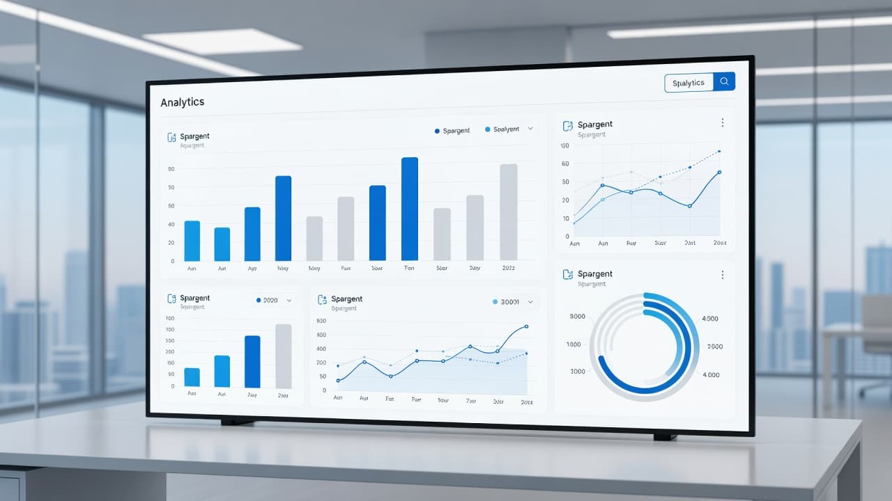
After the metrics are set, the chart choice becomes much simpler. The best data visualization depends on the shape of the data and the pattern you want people to see.
Use line charts for time-series trends. Use bars for comparisons. Use maps only when geography changes the meaning. Tree maps or drill paths can work for hierarchical data. Financial data often needs a clean variance view more than a flashy graphic. This dashboard design guide from DataCamp is a useful refresher on matching data visualization types to intent.
Avoid choosing visuals because they look impressive in a demo. If users must decode the chart before they can read the message, the design is adding work instead of removing it. Excessive complexity increases cognitive load, which ultimately hinders the decision-making process. By following the 5 second rule, you ensure users find the answer they need immediately, rather than struggling to interpret a chart.
4. Use layout and interactivity to guide the eye
Next, shape the page so the eye lands on the answer first. Using an inverted pyramid approach, place your most important KPI at the top, followed by supporting details. Your visual hierarchy should dictate the reading path, ensuring that size, spacing, and placement lead the user to the most critical information first.
Clean pages win. Embracing minimalism means removing decorative shapes, dense legends, and filters that nobody uses. Group related visuals so the story moves in a straight line. Microsoft’s own Power BI dashboard design tips make the same case, focusing on the core UI UX design principles of clarity and layout. When applying user experience design best practices, the goal is to keep the display as uncluttered as possible.
Interactivity should lower effort, not raise it. Interactive graphs, drill-down features, report navigation buttons, and hidden tooltip pages work well when they help people move from summary to detail without losing context. If every click feels like extra work, the dashboard stops being useful.
Make the dashboard trustworthy after go-live
5. Add security, testing, and performance checks
Design is not finished when the page looks good. People use dashboards when they trust the numbers, get fast answers, and only see the data they should see. This transition from visual design to the underlying model is a critical phase in enterprise analytics.
Start with the model. Keep measures tidy, move heavy row-by-row logic upstream when you can, and only load the data grain you need. Daily reporting rarely needs every transaction timestamp if a summary allows for real-time updates through an aggregated view. This keeps refresh times lower and visuals more responsive, which makes ongoing performance monitoring much more effective.
Security matters, too. Build role-based dashboards with row-level security tailored to specific teams, regions, or job functions, then test these configurations after publishing since access is enforced in the service. A polished report page cannot compensate for weak model rules. In practice, the best dashboard teams treat design, model logic, and access control as one unified job.
6. Design for daily use, including mobile
The last step is simple to say and easy to skip. Design for the way people will use the dashboard each day.
Many executives read reports on phones between meetings, while analysts review detail on larger screens. A mobile layout requires intentional user experience design to succeed. You should reorder visuals, increase touch targets, and use progressive disclosure to keep only the few items that matter most on a small screen. A desktop page squeezed onto a phone is not a mobile experience.
Daily use also depends on where the report shows up. If your teams work in Power BI, Teams, Excel, or embedded business apps, put the report inside that flow. Adoption rises when the dashboard is easy to reach, quick to scan, and stable during busy periods.
When dashboard design turns into a Microsoft Fabric project
Sometimes the dashboard is fine, but the platform underneath it is not. Slow refreshes, copied spreadsheets, weak key performance indicators, and manual exports are data problems first. When these issues persist, your dashboard design framework should signal the need for a larger data platform modernization and enterprise analytics effort to support your business intelligence goals.
Spargent Analytics is a specialist Microsoft Fabric consulting and delivery partner for US-based mid-market and enterprise teams. Services delivered by senior Microsoft Fabric experts from Europe. That model gives buyers strong communication, an efficient cost structure, and better ROI than many US-only consulting models. It also helps companies that already have internal teams and need extra senior capacity for their enterprise analytics projects.
Spargent provides Microsoft Fabric consulting services through experienced consultants, and each engagement includes a senior expert. As a Microsoft Fabric implementation partner, Spargent supports migrations for companies that want to move to the cloud without breaking current reporting. That includes Power BI to Microsoft Fabric migration, stronger integration, and hands-on analytics consulting.
The delivery scope covers data engineering, Fabric Data Factory consulting, Dataflows Gen2 implementation, Lakehouse and Warehouse design, OneLake consulting, and semantic models. We also apply UI UX design principles to ensure that your data visualization efforts remain intuitive for the end user. When teams need live operational reporting, Fabric Real-Time Intelligence can sit beside Power BI in the same governed environment. Spargent also helps with semantic model optimization, governance, capacity planning, and managed services after go-live.
For leaders comparing data engineering consulting firms, the business case is direct. Faster reporting, fewer Excel workarounds, stronger data pipelines, and better-governed semantic models reduce pressure on your internal team. If your dashboards keep exposing upstream problems, a Fabric Readiness Assessment can help you improve your decision-making process before you add another report page. Integrating these technical improvements early in the decision-making process ensures that your infrastructure is built to support long-term reporting success.
Frequently Asked Questions
Why do most dashboards fail to gain traction?
Most dashboards fail because they lack focus, attempting to show too many metrics to too many different user groups at once. When a page is not tied to a specific business decision, users find it overwhelming and eventually stop checking it entirely.
How can I decide which charts to use on my dashboard?
Choose chart types based on the specific pattern you need to communicate, such as time-series trends for line charts or comparisons for bar charts. Avoid selecting complex visuals simply because they appear impressive, as they often increase the effort required for users to extract insights.
Should I build different dashboard versions for different devices?
Yes, creating a mobile-specific layout is essential if your stakeholders need to check insights on the go. Simply shrinking a desktop report makes it unreadable, so you should use progressive disclosure and larger touch targets to provide a clean, high-impact mobile experience.
How does the data model affect dashboard design?
Design is inseparable from the underlying data model, as poor model logic leads to slow refresh times and inaccurate reporting. By optimizing your semantic model and keeping heavy logic upstream, you ensure the dashboard remains fast and reliable for the end user.
Conclusion
People use dashboards when the page answers a real question fast, and the data behind it feels solid. That takes more than nice charts. It takes a clear dashboard design framework, a dependable model, and a platform that can support daily use. By utilizing effective data visualization, you turn complex figures into actionable insights that move the needle.
In Power BI and Microsoft Fabric, adoption usually increases when teams keep reports simple, metrics consistent, and governance tight. When those pieces line up, the dashboard stops being a presentation artifact and becomes a core part of the decision-making process. Ultimately, by applying thoughtful UI UX design principles to your projects, you ensure the human element is prioritized, turning your dashboard into an essential tool for how the business runs.
